A very complex and difficult relationship if I may say so. Let's throw in a little background here: I was kinda of oblivious to art as a kid. Yes, I liked to draw but I never really wanted it to be my profession in the future. I wanted to be a professor of history... Ahaa, so funny. Somewhere during junior high I really got into drawing and painting and I wanted to try my hands on it...
Thus I got into art high school, studied(/worked) there for 3 years and then applied to University of Applied Sciences to study Industrial Design. I'm still not sure about that move but I'll figure that out later. Because of that, I'm now finding myself in Japan, doing the end of my exchange studies. Soon I'll return back to Finland but probably not for long as I inted to return back here sooner than you might think.
I wanted to talk little about art but I'm not sure how I'm gonna do it. Or how long it's going to be, probably just gonna keep it short and sweet.
So art and design in Japan. Because I am here. And what people think about when they hear Japan? It's something visual, something with colours and pictures and some kind of text... Ads? Graphic design. Moving pictures... Clean lines with soft colours, minimalistic approach. Well that's what the youth at least associates Japan with. Like I do most of the time.
Pictures and sounds are everywhere. Little signs and ads everywhere.
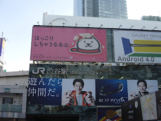
And oh, ads. Most of them here have like But ohdear signs, the pain in my eyes and heart. They are all gaudy and horrible and service only for one reason and one reason only; to get your attention. All those red and yellow signs with simple text just make me wanna flip the closest bicycle to the ground. They shouldn't be plentiful, it's Japan right?
But to my horror, roughly 80% of the adverts and billboards just scream to me in the most unpleasant way.
They are in bright colours.
Usually red and yellow.
Fonts scream Comic Sans.
That accompanied with concrete buildings and you're set and ready to weep for all that is human in advertising and graphic design.
 |
| Nice big ads from Shibuya |
 |
| IFyou're in Akihabara/other famous anime/manga spot, most likely the ads look like this |
 |
| At least the typography is somewhat nice... But Harajuku is a good example of a classy bad advertisement |
Japanese also believe in the power of hand written ads/sale notices. What you see in a second hand shop usually, this rule applies to everywhere in the world.
But then again, I've grown very fond of the ads in trains (and with some TV ads). They are just too damn cute and do their job; make the product/service they sell interesting and you wanna know more about or even buy it. After watching Dove soap ad in a train with these cute little sheep, I really wanna buy some DOVE soap... Even though sheep smell superbad when they are wet but still, sheep were cute and awsum.
Just because how much animation there is everywhere is so smooth. You might get choppy ads with them in Europe too but here it's just been taken so far. All the brands have some kind of (usually cute) mascot to represent them. So that one type of Dove shampoo has sheep, Nissan has kangaroos and Panasonic's appliances have something for both female and male audiences; a beautiful woman and the cutest little dog that has ever existed. EVER.
Also the signs around town, warnings etc. They have so much visual information.
Good example is from Kyoto where it's not allowed to ride your bike in the center. Instead of having just boring text with red cross over a bicycle, there's a picture of a penguin walking with his bike.
ISN'T THAT COOL OR WHAT?
Industrial design part of this all... It felt like Japan has this weird habit of hiding it unless it's graphic design or something close to it.. I visited Japan's first official design museum (21_21 DESIGN SIGHT) in Roppongi. But I know there are a lot of design studios/shops around Tokyo. A lot. There are not just places to visit just to see things and learn about Japanese design. Individuals and styles are much better presented abroad (like in Stockholm and Milano).
A lot of art and design conventions are based on voluntary work and freedom. Like Design Festa where I went to with my friend. The basic principle is that you reserve a table, go there with the stuff that you own the rights to/have done yourself and then just sell them and promote. Same goes with Comiket and other art events alike. Those type of things I really like because there aren't that many bigbigbig companies that want you to buy their stuff but it's more about people sharing knowledge... Yes, I ranted this about when I talked about Comiket but I just want to mention it again.
Sharing is caring.
When it's not illegal (it also depends what you regard what is illegal and what isn't)
Here's some pics from Design Festa 2011. I lack good pictures because I don't really like to see things through the camera lens. If I can't remember something without pictures, most likely it's not even worth of remembering.
Yeh, this is good like this... for now. More to come later.
 |
| Clothings/accessories section of the Design Festa |
 |
| More of this supercute booth! |
 |
| Entrance to the Design Festa |
 |
| The event was in two floors |
 |
| I liked this event C: Got a lot of inspiration (this and fuji trip were like mindblowing) |
 |
| SUPERCUTE CARDS... WITH BIRDS. |
 |
| The map was confusing but fun to read. I like maps. |
No comments:
Post a Comment